Distance-structure fidelity,
verified in the open.
Can precursor-monitoring performance be demonstrated reproducibly?
Using six synthetic datasets with known ground-truth geometry (non-uniform density, dense clusters, continuous transition, outliers, imbalanced populations, time-series random walks), we fed identical raw data toeight dimensionality-reduction methods(PCA / Isomap / t-SNE / UMAP / PyMDE / PCC / DREAMS / toorPIA) and quantitatively compared how faithfully each carries high-dimensional distance structure into 2D — do points far apart in high dimensions stay far apart, and close ones close? — using a common metric (distance-band Shepard ρ). The result: toorPIA ranks first overall on five of the six datasets. The code, the hypotheses, and every method's output coordinates are published on GitHub — every number can be recomputed offline by anyone.
5/6
first overall on 5 of 6 datasets
8 methods
compared on identical raw data
9.7×
separation of unseen anomalies (vs. normal-region radius)
10/10
anomalies attributed to their source
* Every figure and metric can be reproduced from the output coordinates published in the repository — no API key required. A valid toorPIA API key is only needed to regenerate toorPIA's coordinates from scratch (the other seven methods run locally, and the benchmark runs end-to-end without a key). The five main datasets are 768-dimensional with 1,000 points; the time-series dataset is 50-dimensional with 4,000 points.
This benchmark is created and maintained by the vendor of toorPIA. Precisely because of that, it was designed so that its conclusions do not depend on our judgment.
- 01A strict layout-algorithm-versus-layout-algorithm comparison: all eight methods receive exactly the same raw vectors — no toorPIA-specific preprocessing or normalization
- 02Metrics are computed exactly, on all pairwise distances, independently of every method
- 03The near-distance evaluation band is defined automatically from the data's own distance distribution — no room for hand-tuning
- 04Hypotheses are documented and committed before the results are produced
- 05Every method's output coordinates are published — all numbers are third-party recomputable offline
- 06No winner is claimed when confidence intervals overlap, and results for every dataset are listed (joint third overall on the continuous-transition dataset — see section 06 below)
The repository is published under the MIT License and permanently archived on Zenodo (DOI: 10.5281/zenodo.21189374). The methodology and headline results are also published as a preprint —arXiv:2608.21779, “A Fixed-Radius Distance-Band Benchmark for Dimensionality-Reduction Fidelity” (Takaeda, 2026).
Build the map from normal data only.
Then add the unseen anomalies.
A reference map is built from data containing no anomalies at all, and unseen anomalies are then added to it one by one (addplot). This is not an artificial laboratory setup — it is the monitoring operation itself. Each anomaly shares the measured features of a normal cluster while shifting along new dimensions in which the normal data never varies.
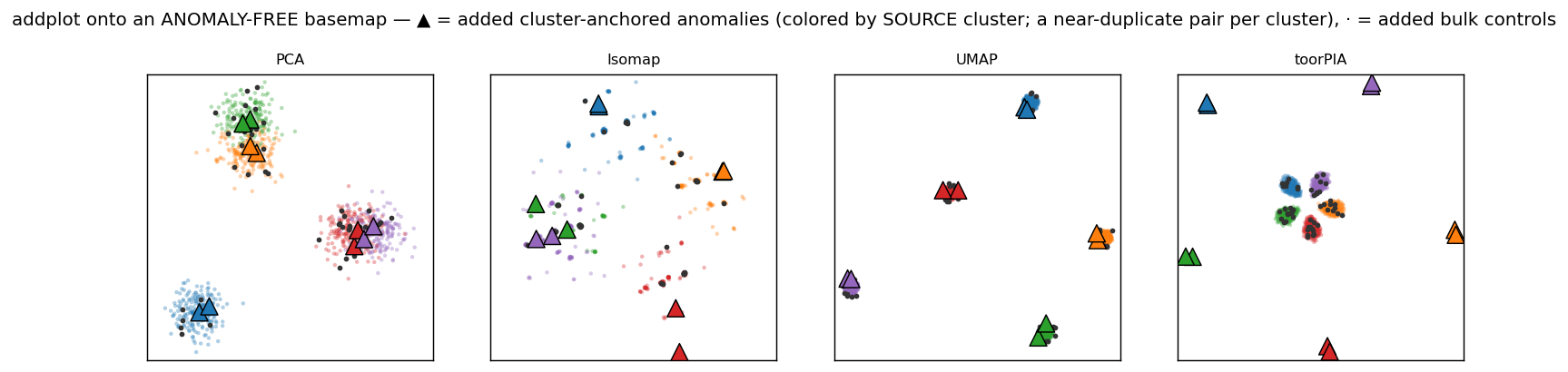
▲ = added anomalies (colored by source cluster). In PCA, Isomap, UMAP, and DREAMS the anomalies sink into the normal clusters; in toorPIA every anomaly lands clearly outside the normal region, pointing toward the cluster it originated from.
t-SNE / PyMDE / PCC
In the standard implementations used in this benchmark, these methods have no out-of-sample transform — no way to place a new point on an existing map.They cannot perform this monitoring operation at all.
PCA / Isomap / UMAP / DREAMS
They can place the anomalies, but at a median distance of only0.96–1.34× the normal-region radius — the anomalies are buried inside the normal data, and the map raises no alarm. Getting the direction right is worthless when the anomaly is drawn as just another normal point.
toorPIA
The only method of the eight that places an unseen anomaly outside the normal region at all.The anomalies are separated to 9.7× the normal-region radius(median; 8.7× at minimum), and their direction points at the source cluster (attribution 10/10, accuracy 1.000; median angular error ≈ 0.9°). The one method that answers both “something is wrong” and “where it comes from.”
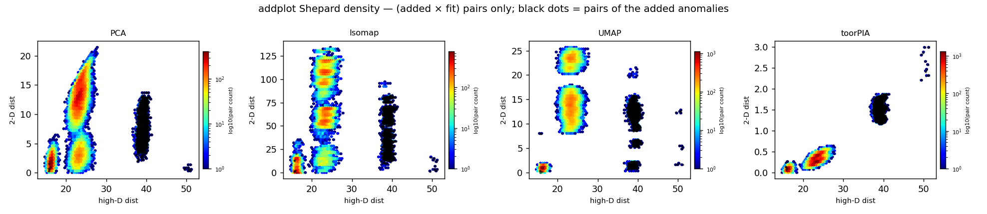
High-dimensional distance (x) vs. 2D distance (y) for added × reference pairs. Only toorPIA keeps the relation monotonic, with the anomaly pairs (black) separated at the far end.
A monitoring baseline that
doesn't move when you rebuild it
t-SNE and UMAP are stochastic: the same data produces a different layout on every run. toorPIA is fully deterministic — results are identical across seeds. In the out-of-sample test above, the separation distances of the anomalies matched exactly from seed to seed, with zero run-to-run wobble.
Stochastic methods (t-SNE / UMAP, etc.)
The layout changes on every run
Normal regions and thresholds drift with each retraining, forcing the monitoring baseline to be re-tuned.
toorPIA
Identical results across seeds
The reference map, normal region, and thresholds stay fixed — a map you can operate as a long-term monitoring system.
Keep both the distance and the kind
of an outlier on the map
A dataset mixes three kinds of outliers — six points in total, a near-duplicate pair per kind — into the normal clusters, and measures how faithfully outlier-involving distances survive the trip to 2D. toorPIA keeps same-kind outlier pairs co-directional (within 10°) and separates the three kinds into distinct locations — preserving both how far off a point is and what kind of deviation it is. Overall, toorPIA ranks first of the eight methods (a composite score of 13 — rank points summed across the metrics, as detailed under Overall Rankings below; runner-up PCA at 9).

★ = ground-truth outliers (color = kind of anomaly; a/b = the near-duplicate pair). In PCA and Isomap the outliers sink into the clusters; in toorPIA the three kinds separate in different directions with each a/b pair adjacent.
Shepard ρ restricted to outlier pairs (higher = more faithful)
Rank correlation between high-dimensional and 2D distances, restricted to outlier-involving pairs (outliers dataset, SNR=1 — signal and noise equally strong)
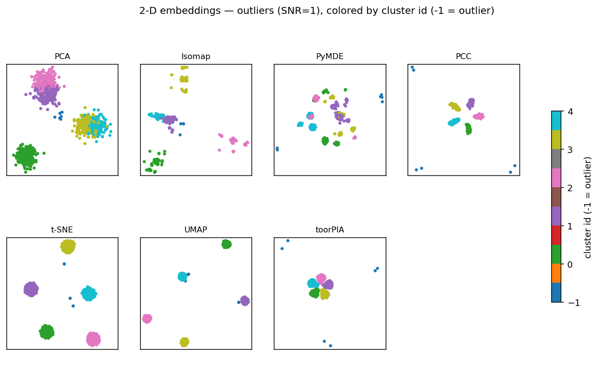
The full picture, colored by cluster id. toorPIA keeps the mutual layout of the five clusters while pushing the outliers (blue) outward.
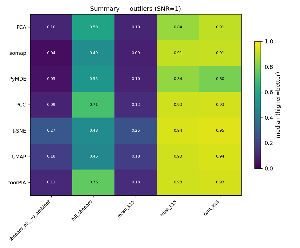
Metric summary. On Shepard ρ over all pairs — not restricted to the outlier pairs of the bar chart above (0.649) — toorPIA leads at 0.768. On neighborhood-preservation metrics, which measure how well each point's local neighborhood is reproduced, t-SNE and UMAP score higher — see “Methods & Limits” below.
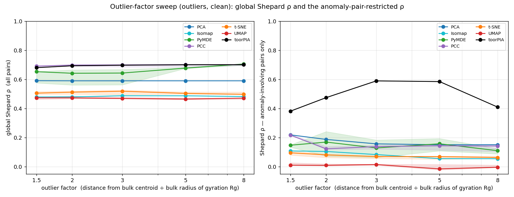
Sweeping the outlier strength (how far the outliers sit from the normal region) and tracking each method's distance fidelity — see the full report for details.
When 95% of the data is normal,
don't crush the other 5%
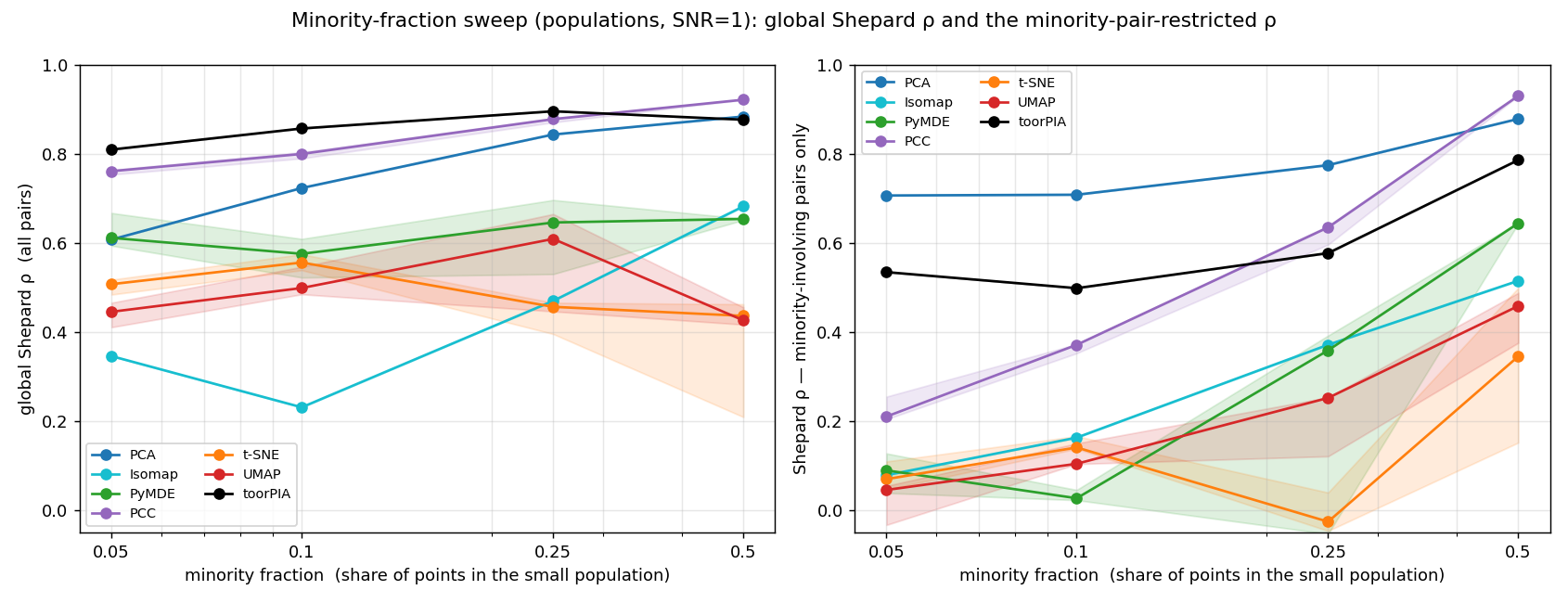
In real monitoring data, the states you care about — anomalies, transients, rare events — are a small minority. Worse, nobody tells you in advance that the minority exists. Tested on a 95% majority vs. 5% minority split, toorPIA keeps the minority's internal structure visible while separating it from the majority, and achieves the best overall distance fidelity (full Shepard ρ = 0.821; runner-up PCC at 0.761).Only toorPIA draws the minority as a recognizable, correctly placed group while also preserving its internal structure — and it ranks first overall on this dataset.
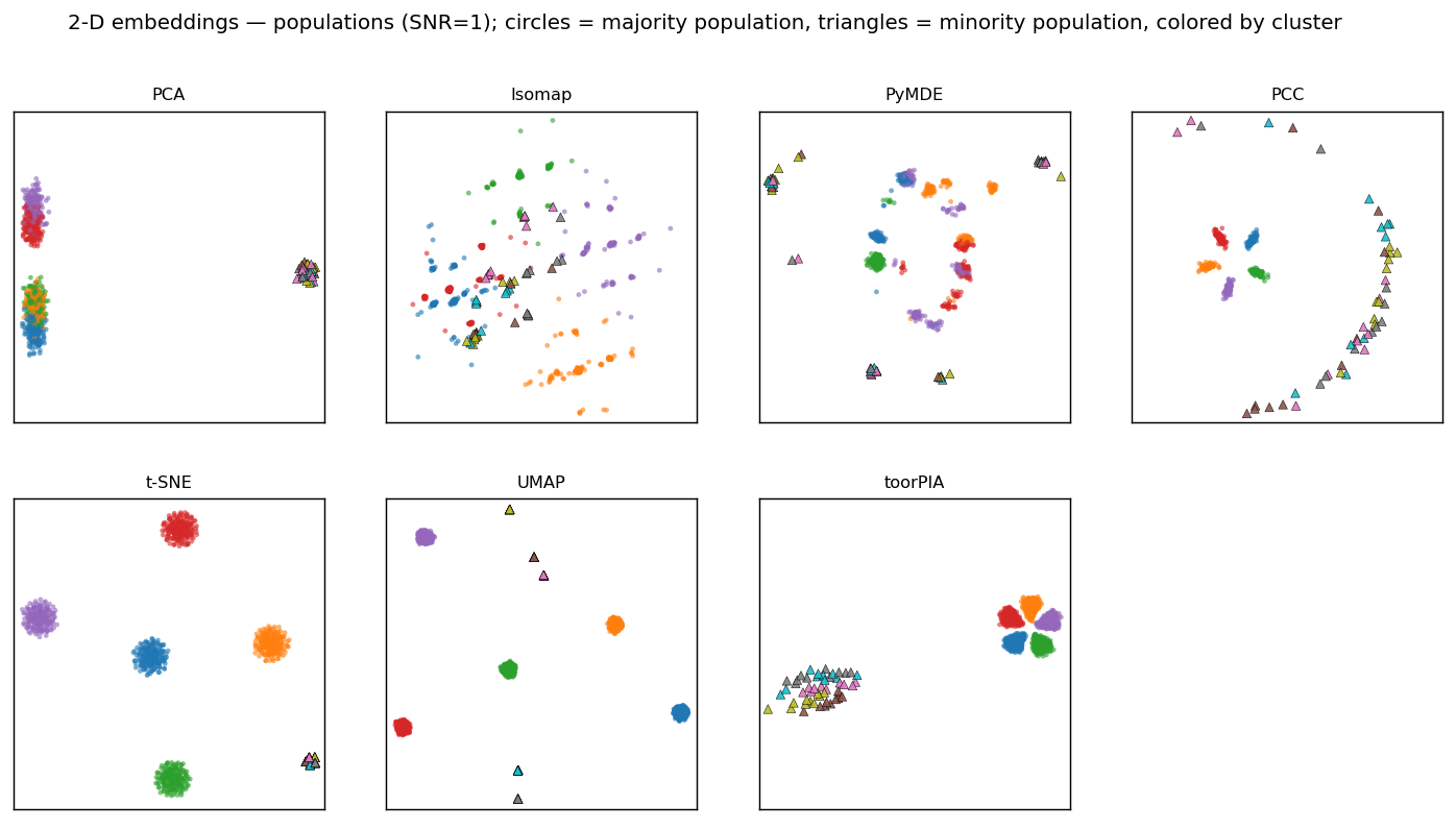
○ = majority, △ = minority. t-SNE fuses the five minority clusters into a single dot, UMAP scatters them into islands at the edge, PCA places the minority correctly but as a featureless blob, and DREAMS keeps its internal structure but flings it to an arbitrary distance. toorPIA preserves both the five-cluster structure of the majority and the minority's placement and internal spread.
Sweeping the minority share from 50% down to 5%
We lowered the minority fraction step by step to see where each method starts crushing the minority's structure.
Reporting multiple perspectives — metrics alongside the visual breakdowns in the gallery above — is a design principle of this benchmark.
Equipment state arrives as a
moving trajectory — not a cluster
Real plant data rarely falls into tidy groups. Operating conditions drift continuously over time — trajectory data that never forms clusters. That is exactly what this test probes. In a 50-dimensional space, eight independent random walks (500 steps each, 4,000 points in total) set out from a shared origin. A high-dimensional walk behaves nothing like a doodle on paper: each trajectory pushes steadily outward from the origin, and the walks radiate along mutually near-orthogonal directions. The ground-truth shape is therefore a jagged “star” of eight spokes. We measure how faithfully each of the eight methods draws that shape on a 2D map.
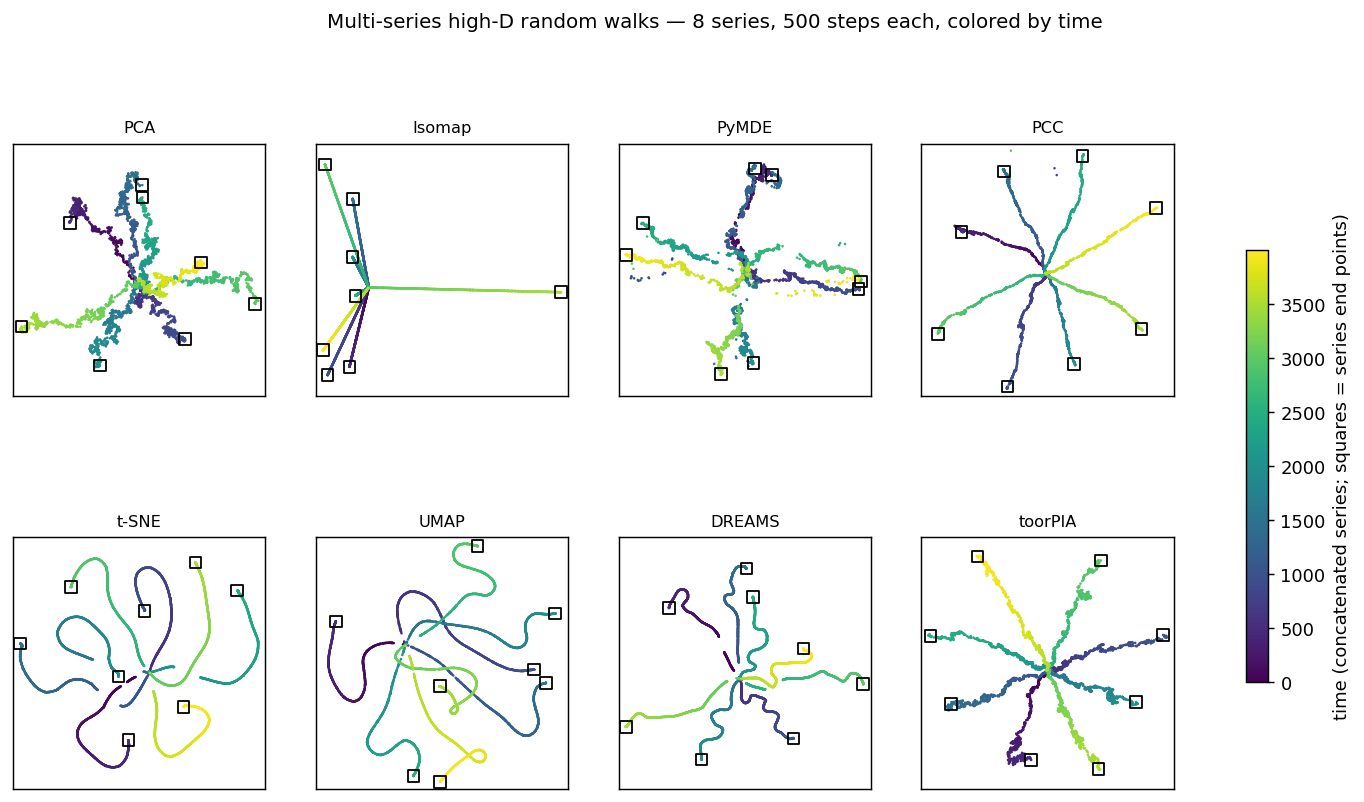
Shading = time (dark = early, bright = late). toorPIA keeps both the star-shaped global layout of the eight walks and their fine step-by-step jitter.
t-SNE / UMAP / DREAMS
They turn the walks into smooth ribbons — the step-by-step jitter is erased almost entirely (saw-tooth score ≈ 0). t-SNE and UMAP also lose the star-shaped layout (inter-series 0.353 / 0.407, the two lowest), while DREAMS keeps the radial arrangement but cuts the trajectories mid-way.
PCC
Second on all three distance readouts (full 0.877, inter-series 0.860, within-series 0.950) — but it smooths the walks, cutting the step-by-step jitter to less than half (saw-tooth 0.436), and strands three points far away from their trajectories.
toorPIA
Distance fidelity (Shepard ρ) of 0.893 over all pairs, 0.871 inter-series, 0.966 within-series —the best of all eight methods on all three readouts. It also keeps the jitter alive (saw-tooth 0.709) — the only method that preserves the local jitter and the global layout at the same time.
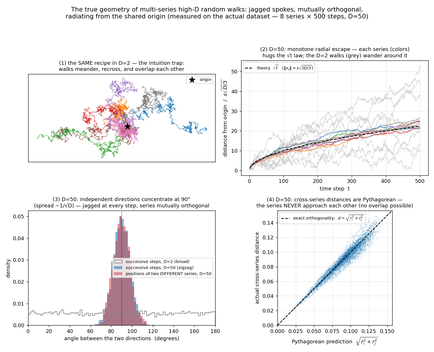
Why the star is the ground truth (all measured on the actual dataset): a 50-dimensional walk escapes the origin monotonically (second panel), and both consecutive steps and different walks meet at angles concentrated near 90° (third panel) — so the true shape is eight jagged spokes at mutual right angles.
Where the numbers and
the maps diverge
On the continuous-transition dataset — seven dense states connected in a ring — toorPIA achieves the best overall distance fidelity (full Shepard ρ 0.729), but its near-band ρ of 0.547 trails PCC, t-SNE, and DREAMS, leaving itjoint third overall (PCC first, t-SNE second, tied with DREAMS).
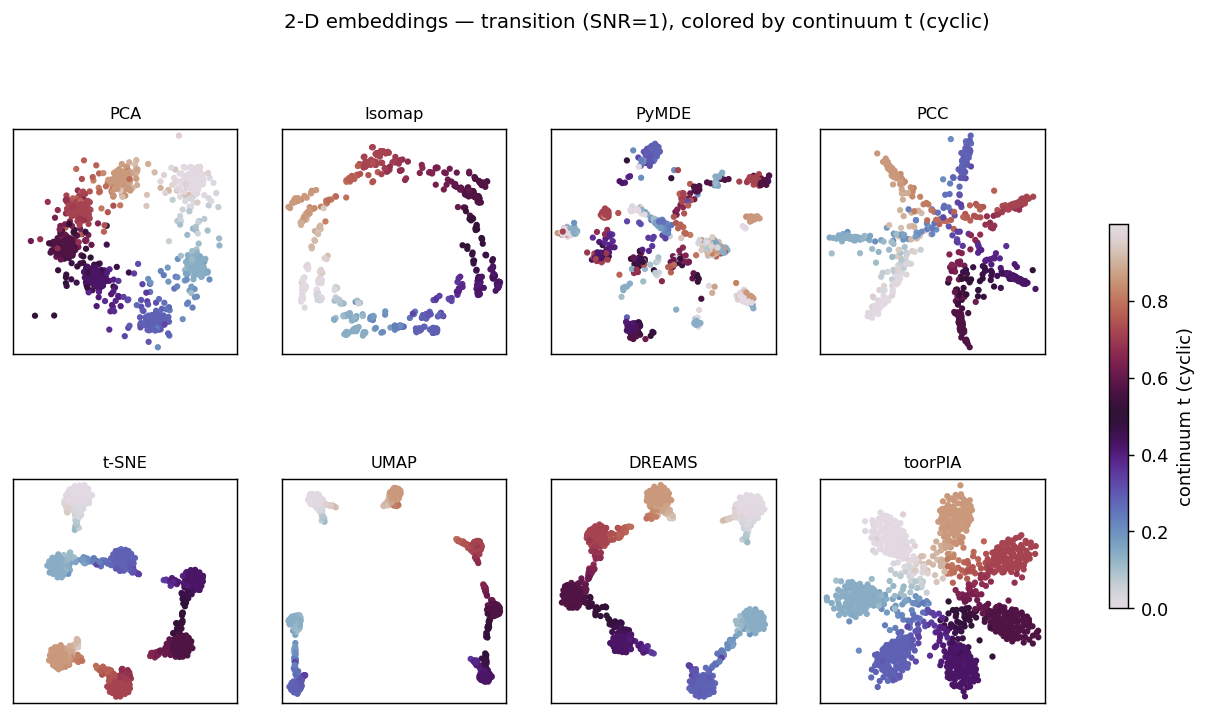
The ground truth: seven states (colors) connected by a ring of transitions. Isomap draws a clean ring but blurs the states; PCA keeps the ring but overlaps the states; t-SNE and UMAP recover the states but tear the bridges apart; DREAMS recovers the states and their cyclic order but tears bridges too, leaving the ring open; PCC collapses radially, leaving every state adjacent to every other.
The maps themselves tell the other half of the story:only toorPIA draws the seven states and the ring connecting them at the same time. This can be quantified. Of the four methods that draw seven dense, separated states (toorPIA, t-SNE, UMAP, DREAMS),only toorPIA keeps all seven bridges connected(largest void: 14% of the inter-state distance; t-SNE tears 4 of the 7 bridges — up to 49% — UMAP 4 — up to 85% — and DREAMS 3 — up to 58%). The figures are published alongside the metrics, so you can judge by both.
Every sensor you add brings
more irrelevant channels with it
In a real plant, nobody knows in advance which variables carry the warning signs — and the more sensors you add, the more channels unrelated to the anomaly you collect. So, as a supplement to the six datasets above, we built data where the meaningful signal lives injust 3 columns and every other column is pure, irrelevant noise — then grew the total number of columns (dimensions) and asked: can you still tell the three states apart in a 2D map? The test is simple: can each point's state be guessed from a majority vote of its neighbors on the map (kNN accuracy)? Random guessing scores 1/3. We ran this test in two stages.
Stage 1: identical conditions for all methods (the layout algorithm alone)
First, all eight methods receive exactly the same raw data. Even here, toorPIA tops every other method — 0.985 at 80 dimensions, 0.920 at 200 dimensions (best of the rest: DREAMS at 0.589). At 200 dimensions it even beats a plain kNN vote on the raw high-dimensional vectors (0.75) — the 2D map is easier to read than the raw data itself. There is a limit, however: 0.767 at 300 dimensions, 0.462 at 400 —the signal is lost somewhere between 300 and 500 dimensions (0.356 at 768, essentially chance).
The seven methods other than toorPIA
Best of the rest: 0.589 at 200 dims
Between 40 and 300 dimensions they fall toward random guessing (1/3) one after another.
toorPIA (identical conditions)
0.920 at 200 dims — best of all methods
It even beats a plain kNN vote on the raw vectors (0.75). But it loses the signal between 300 and 500 dimensions — the limit of the layout algorithm alone.
Stage 2: toorPIA's standard CSV analysis pipeline
Next, the same test with the standard analysis pipeline we deliver to customers for tabular data. The picture changes completely — 1.000 at 200 dimensions, 0.991 at 768, 0.953 even at 2,000. And at 6,000 dimensions — 5,997 columns of pure noise — it still scores 0.821. Compared against a plain kNN vote on the raw high-dimensional data — after correcting for guessing — the 2D map is about 2.9× more effective at 768 dimensions, 5.8× at 2,000, and 7.2× at 6,000:the 2D map identifies the states better than the raw distances themselves.
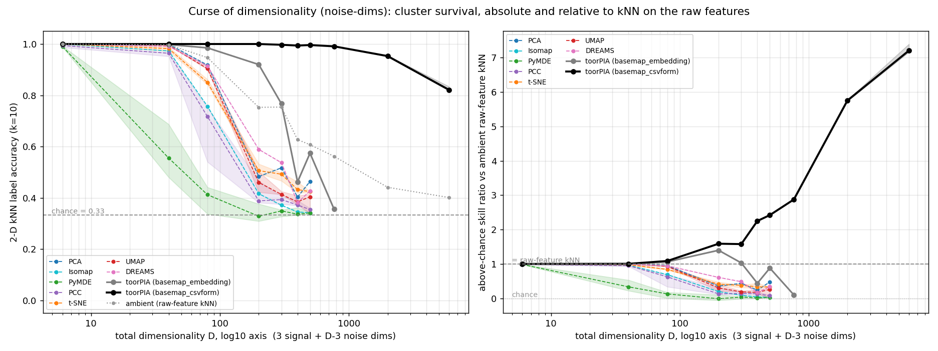
Left: total dimensionality D on the horizontal axis (log scale); vertical axis is kNN accuracy in the 2D map (dashed line = random guessing at 1/3; dotted line = a plain kNN vote on the raw features). Right: the skill ratio against that raw-data baseline. Under identical conditions (stage 1, solid grey) toorPIA leads the other methods but declines between 300 and 500 dimensions; the standard pipeline (stage 2, solid black) still tells the states apart at 6,000 dimensions.
Standard pipeline
0.953 at 2,000 dims, 0.821 even at 6,000
At 768 dimensions — 3 signal columns against 765 columns of noise — it scores 0.991, nearly perfect. Even with 5,997 pure-noise columns at 6,000 dimensions, it still tells the three states apart.
Versus the raw data
≈ 2.9–7.2× the skill
After correcting for guessing, the 2D map beats a kNN vote on the raw high-dimensional data by about 2.9× at 768 dimensions, 5.8× at 2,000, and 7.2× at 6,000 — the map preserves the states better than the raw distances.
This robustness does not come from a separate denoising step bolted on in front, nor from telling the pipeline which columns carry the signal. The input is the same data as in stage 1, processed in the standard shipped configuration with no per-dataset tuning.The method itself is robust to noise dimensions (how it achieves this is proprietary).
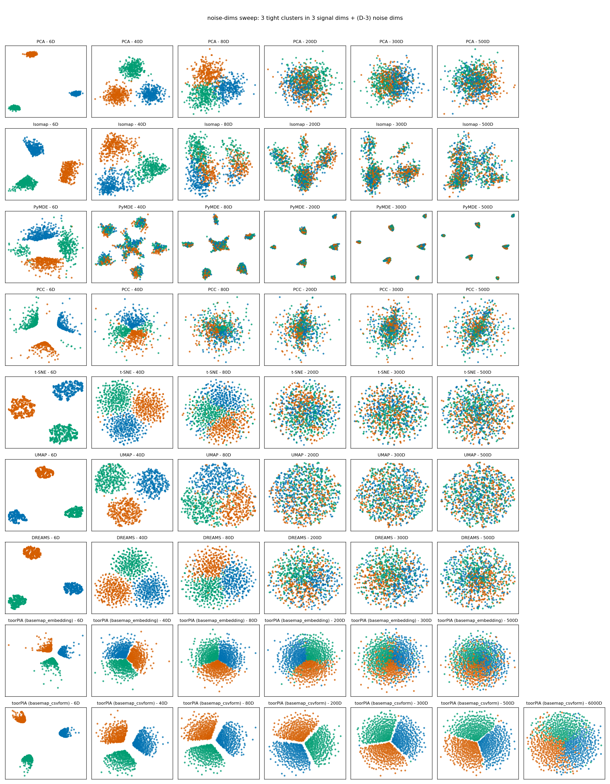
2D maps at representative dimension counts, with the three true states colored. As dimensions grow, the other methods' clusters dissolve and merge. The bottom row is the standard pipeline; its right-most panel is the 6,000-dimension map.
Why does the signal survive at this extreme? For the explanation — distance concentration and a design that does not rely on neighbor graphs — see thetechnology page.
* Design note: the main datasets spread their signal across all columns (high redundancy), so the curse of dimensionality does not operate there by construction. This supplement probes the opposite extreme — 3 signal columns plus pure-noise columns only — where the effective signal-to-noise ratio is 3/(D−3), about 0.004 at 768 dimensions and 0.0005 at 6,000. Stage 1 corresponds to the report's basemap_embedding call (identical raw vectors for every method, no preprocessing); stage 2 to basemap_csvform (the standard CSV analysis pipeline). The 2,000- and 6,000-dimension cells aggregate 5 independent noise realizations × 3 seeds (realization spread: 0.94–0.96 at 2,000, 0.80–0.84 at 6,000). Results are setting-dependent: rankings from the main datasets need not transfer to this sparse-signal setting, and vice versa. See the full report for the experimental conditions and complete numbers.
Six datasets, overall results
For the five main datasets, the overall ranking is a composite score: on every metric, ranks 1–5 earn 5–1 points. toorPIA ranks first overall on four of those five. The time-series dataset has no composite score, so we count it as a win on the strength of leading all three distance-fidelity readouts across the eight methods — five of six datasets in total. And the one it lost is published right alongside.
What this measures — and what it doesn't
The benchmark measures how faithfully high-dimensional distance structure is carried into 2D, on six synthetic datasets with known ground-truth geometry (non-uniform density, dense clusters, continuous transition, outliers, imbalanced populations, time-series random walks), plus a noise-dimension sweep supplement (07 above). The core metric, distance-band Shepard ρ, takes the rank correlation between high-dimensional and 2D distances within distance bands, and is computed directly on all pairwise distances, independently of any method. The near-distance band is defined automatically from the data's own distance distribution — there is no room for hand-tuning.
On k-nearest-neighbor preservation metrics such as recall@k, t-SNE and UMAP rank higher. And on the near-band fidelity alone, DREAMS — a 2026 method that regularizes t-SNE toward the PCA layout — leads on all five main datasets. That reflects a difference in what each method optimizes for, and the benchmark deliberately reports multiple metrics on the premise that no single number tells the whole story. If reproducing local neighborhoods is the goal, neighbor-based methods are the right tool; if the goal is a monitoring map that preserves distances, directions, and minority structure, toorPIA is the right tool — that is the takeaway.
* All results are on synthetic data; applicability to real data must be validated per project. The repository is maintained by the vendor of toorPIA, and transparency safeguards (hypotheses documented before results, all output coordinates published, no winner claimed on overlapping confidence intervals) are in place with that in mind. All methods run at library-default parameters, and a published sensitivity analysis sweeps each method's key parameter — no setting changes any dataset's composite leader. For the experimental conditions, metric definitions, and complete numbers, see the README and the full REPORT.
Every number here can be recomputed on your machine.
The code, the data generators, and every method's output coordinates are published under the MIT License. For questions about applying toorPIA to precursor monitoring, feel free to contact us.
* No API key is needed to recompute the results — every figure and metric can be reproduced from the published output coordinates. A key is only required to regenerate toorPIA's coordinates from scratch — contact us if you would like one. For academic use, cite the paper (arXiv:2608.21779) or the data-and-code DOI (10.5281/zenodo.21189374).